Art Style Rework
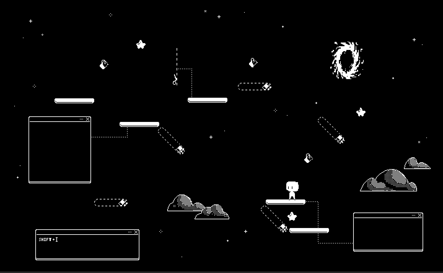
Hey guys it’s Tinyan, here to chat about the art of Heibai and where it’s at so far. Over this second semester of development, our game has undergone a major transformation in its art direction. Our team were able to agree on a more solid theme/narrative, which in turn informed the artistic style we ultimately chose to pursue. We decided to include elements of computer/cyberspace in addition to our original space theme. The settings depicted in the level backgrounds would transition slowly from the ground up to space, with more and more graphics related to computer programs introduced as the player progressed (such as copy and paste icons, file icons, sticky notes etc) as well as space related things (like stars and meteors). The new art style is much more geometric to reflect the tech-y, computer theme.
I was in charge of most of this operation, namely redrawing all the backgrounds. One of the intentional stylistic choices I made was changing the platform design to be more solid in colour, while objects in the background that the player cannot collide with will have thinner or dotted outlines, or have dithered shading. These changes should help in improving the game’s clarity both in gameplay and visually, areas which we previously received suggestions to improve on. Apart from revamping the art style, we also went ahead with polishing up existing art — by adding in some new animations for the character, and also adding some animations to the backgrounds, so keep an eye out for these fresh new changes!

Get Heibai
Heibai
| Status | Released |
| Author | Splat!Games |
| Genre | Platformer, Puzzle |
| Tags | 2D, Black and White, Puzzle-Platformer, Singleplayer |
More posts
- Final VersionNov 26, 2023
- Walls.Nov 19, 2023
- Art Style and Release Date!Nov 19, 2023
- HeibaiNov 18, 2023
- What I was doing last week.Nov 18, 2023
- Progress updateNov 17, 2023
- Rule BreakingNov 03, 2023
- Favourite Part of the ProjectOct 16, 2023
- Favourite part of the projectOct 13, 2023
Leave a comment
Log in with itch.io to leave a comment.